
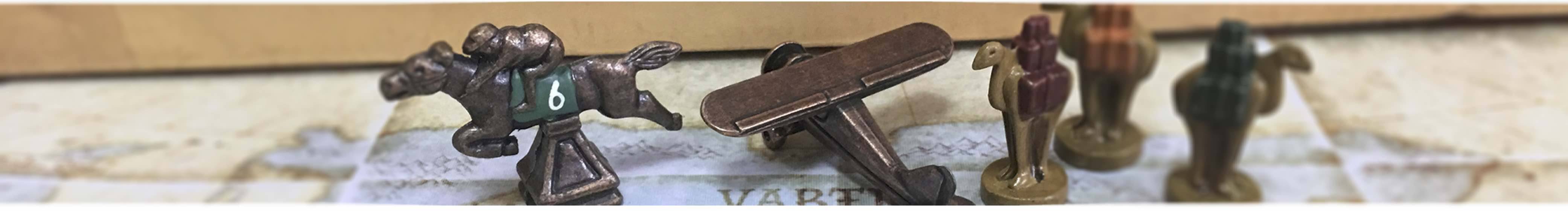
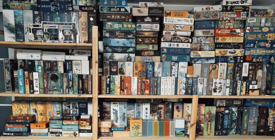
Looking at the rows of board games on the game rack, can you remember the game whose cover is likable at first view? Or the game whose mechanism is fun, but it looks a little scary.
To some extent, the cover of a game determines whether a game is good or not. With the improvement of people’s aesthetic level, board games are no longer a product that only involves mechanics. Game art has long become an important factor in whether a board game can be sold well.
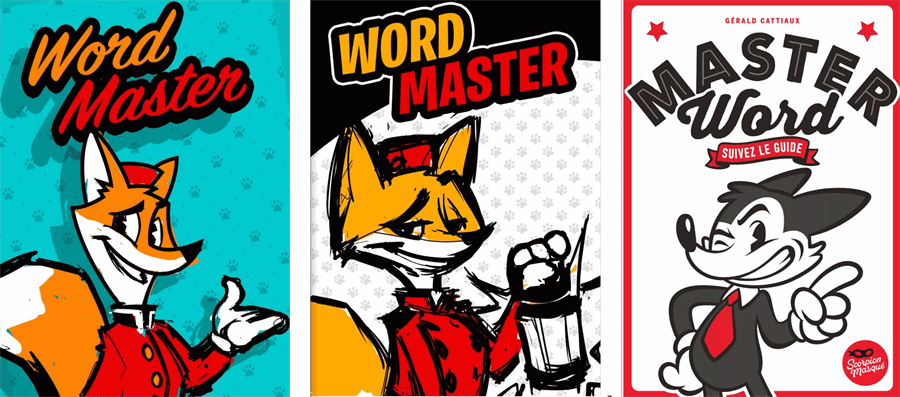
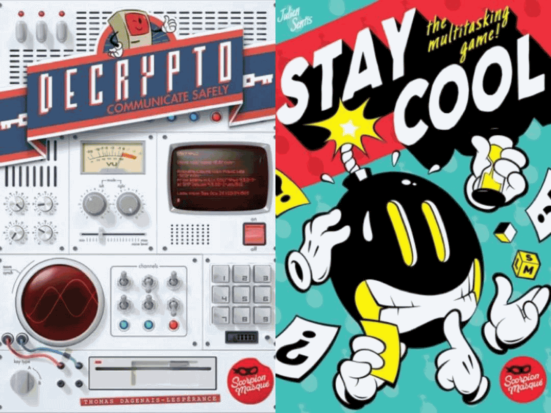
Recently, the game company which had published Decrypto released a new word-guessing game: Master Word. The art director of the game, Manuel Sanchez, showed players the overall visual and cover design process of the game.
A seemingly simple game cover has actually gone through a lot of doubts, guesses, and repeated attempts. As a party game, how to stand out from many games become a difficult problem for Master Word.
Game Description
Master Word is a word-guessing party game. In the game, one player is the guide, drawing cards from the deck. The rest of the players are responsible for guessing the words.
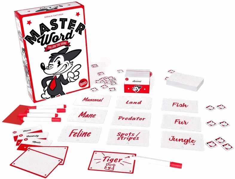
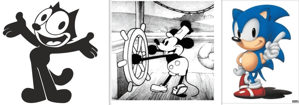
Master Word is divided into two parts, the white part is the broad scope of the words, the red part is the specific character, such as: animal-cow, brand-adidas, character-Mickey Mouse, etc.
The white part will be shown to the guesser. A round of the game has a total of 90 seconds for the guessers to guess the word and fill in the guessing card. Each player has three red guessing cards.
How to make party game covers?
For a normal party game, the investment of time and resources seems futile. But, as the saying goes, simplicity is the ultimate complexity. Especially when we want to add too much, but we don’t want to be the same as “others.”
When we first see a board game, what is the first thing that attracts us? Yes, it must be the box cover of the game. In a themed game, the characters we see on the cover are the avatar of the player, the character they play in the game.
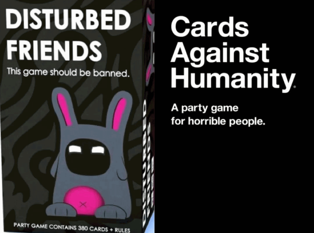
However, for non-themed games, especially party games with no specific characters and guessing words, the problem of making a compelling cover is a constant one. First of all, party games have such a wide audience that a casual game cover won’t appeal to anyone.
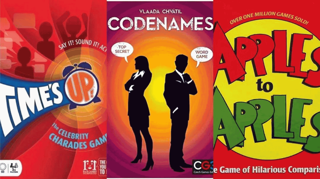
If you have too many elements in your cover, people won’t know what kind of your game should be. For example: If you design a plain cover, like, an extremely rich background with a big title, your game will be lost in the hundreds of ordinary games, just like everyone else. In recent years, a number of party games have made a name for themselves in the board game industry with their distinctive graphics.
When Language for skyshatter machine with minimalist cover of the book came out, many people thought it was commercial suicide. But in fact, this latest cover is really striking. We also created our own “white gloves” and retro cartoon features on the cover of the game, which had further success.
“You” are the real protagonist—-
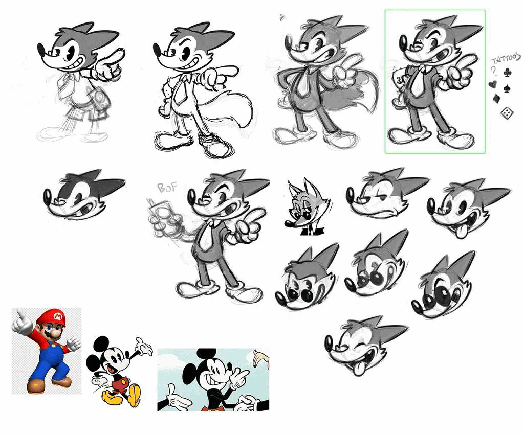
In Master Word, because of the role of the leader, the illustrator Sebastian and I decided to draw a figure as a concretization of the image of the leader. However, creating characters is a very dangerous job: girl or boy? Young or mature? Black or white?
In our game, the game of writing words and guessing words is a game that tests reaction and wisdom, and the fox is actually a better choice-but this raises another question: Is it too naive?
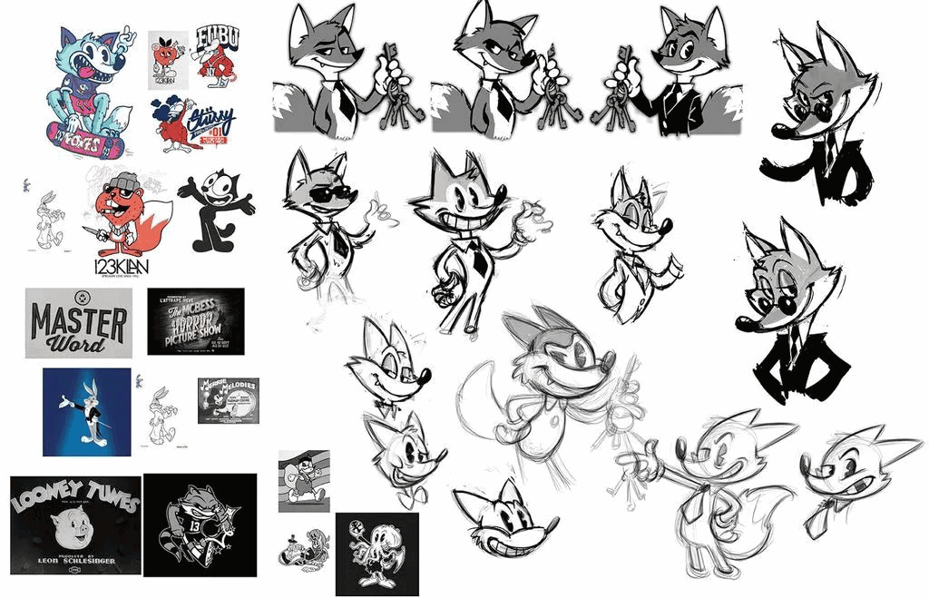
Sebastian said that if our characters blend retro and modern, there will be no such doubts, such as:
Based on this, (illustrator) drew sketches of different animals.
The ultimate in complexity is simplicity–
After discussing with game designer Gérald Cattiaux and French illustrator Asmodee, we determined the overall outline of the game together: the red stars not only add color, but also reflect the theme of the party game.
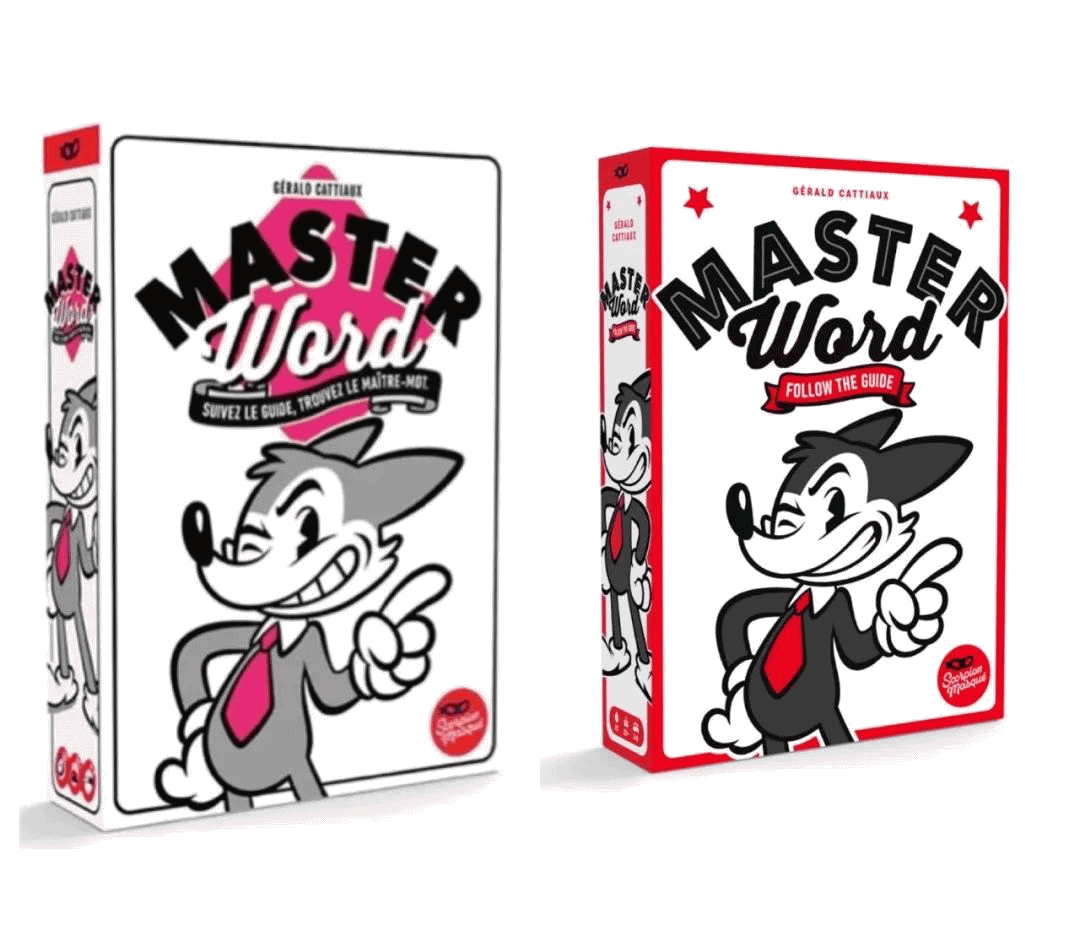
In this way, the game cover and overall vision of Master Word were designed in this way. The combination of classic red and black is simple and generous. The head of the little fox distinguishes the front and back of the card, and the design of white and red on the cue card is also very comfortable and in line with the overall effect.
We often focus our design on the game’s mechanism design and study its success. In fact, the colors of the covers, cards, and tokens wherever we look are all carefully designed.
Game designers often say that game design is a process of continuous subtraction. The design of the game cover is also a process of simplifying complexity. After all, board games are a whole, and art also reflects part of the strength of board games.
Post time: Jan-18-2021